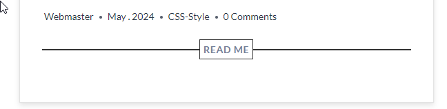
Add a Full-Width Line Behind the Read More Button

Enhance your archive pages with a sleek, full-width line behind the “Read More” button using this straightforward CSS hack. Simply insert the following CSS snippet into your preferred code snippet manager or the theme’s additional CSS section
*This coding is for Kadence themes only.
I use fluent snippet plugin for all my functions, js, and CSS:
CSS:
/* read more */
a.post-more-link .kadence-svg-iconset {
    display: none!important;
}
a.post-more-link {
    position:relative;
    top: -12px;
    z-index:3;
    font-weight: 600;
    letter-spacing: .05em;
    text-transform: capitalize;
    text-decoration: none;
    color: #718096!important;
    font-size: 14px!important;
    padding: 5px 15px;
    border: 0px solid #ebebeb;
    background:#fff!important;
}
a.post-more-link:hover{
    border-color: #718096!important;
    color:#333!important;
}
.entry-footer {
    text-align: center;
    margin-bottom:50px;
}
.entry-footer::before {
    display: table;
    content: '';
    position: relative;
    top: 21px;
    left: 0;
    width: 100%;
    height: 1px;
    background: #718096;
    z-index: 2!important;
}
- I’ve included a border but turned it off from showing on the read more button. in this line: border: 0px solid #ebebeb;
in the
a.post-more-link
Section.
In this section you will might need to center the line in the center of the read more button.
.entry-footer::before -> top:21pxx
and in the
a.post-more-link ->top: -12px
In the
a.post-more-link
You can play with the padding
also u will need to set a color for the background of the button to fit your theme in the
a.post-more-link
also you can change the color of the line as well in the
.entry-footer::before -> background:#333
Enjoy and always AS IS


Add your first comment to this post
You must be logged in to post a comment.