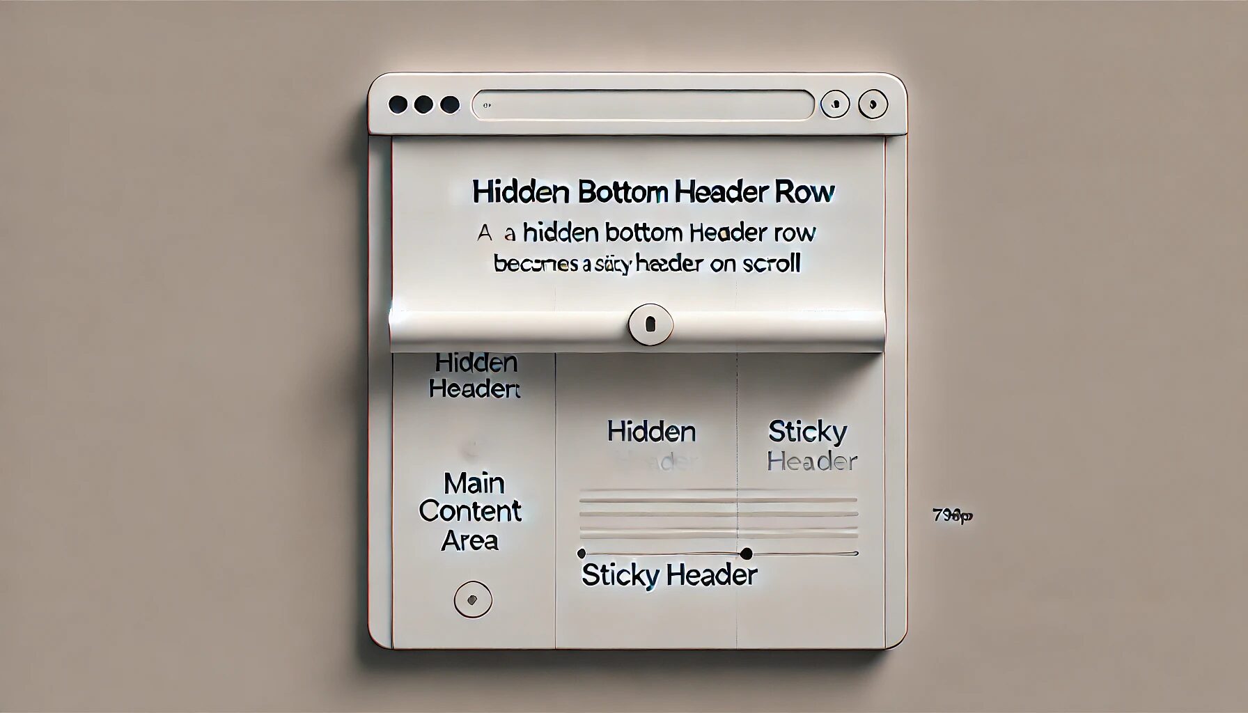
Creating a Hidden Sticky Header on Scroll in Kadence Theme
Creating a Hidden Sticky Header in Kadence with CSS
In my recent project, I wanted to keep the bottom row in the Kadence theme header initially hidden and only visible when scrolling begins. Using a CSS trick, I achieved a sleek, responsive hidden sticky header effect that appears smoothly as users scroll down. I have it set to only work on desktop view.

The Kadence theme offers flexible header layouts, and I took advantage of this by working with the bottom row. Here’s the CSS code that made it happen:
I use fluent snippet plugin for all my functions, js, and CSS:
I used the CSS below in fluentSnippets.
/* Initially hide the bottom row */
.site-bottom-header-wrap {
    opacity: 0;
    transition: opacity 0.2s ease-in-out;
}

.site-bottom-header-wrap.item-is-stuck {
    opacity: 1;
}
Here’s how it works:
- Initial State: The
opacity: 0;rule hides the bottom row when the page loads, making the header section appear as a minimalist design without distractions. - Transition: The
transition: opacity 0.2s ease-in-out;rule ensures a smooth fade-in effect, which feels natural and intuitive when the user scrolls. - Sticky State: As soon as scrolling begins, the
.item-is-stuckclass is applied to the bottom row, changing the opacity to 1 and revealing the sticky header.
This small CSS adjustment provides a dynamic user experience, bringing key information or navigation links into view only when needed. It’s a handy trick to keep headers clean while ensuring accessibility to important links on scroll.
Deep Dive Summary
This excerpt from a WordPress tutorial describes how to create a hidden sticky header that appears only when a user scrolls down a webpage using the Kadence theme. The author, Scot, emphasizes the benefits of this design approach, arguing that it reduces distractions and improves user experience by keeping the focus on the main content and only revealing additional navigation when needed. He highlights the subtle yet impactful visual effect of the header gradually fading into view, creating a more engaging and professional feel. The tutorial provides step-by-step instructions and encourages viewers to experiment with this technique to enhance their website’s design.
Was this information helpful?


Comments: